
Banner ads get about two seconds of attention on a good day. The design earns those two seconds. The copy decides what happens next. A designer can spend three days nailing a banner’s hierarchy, color, animation, and resize behavior, and lose to a worse-looking ad with better copy. That’s the brutal asymmetry of display: the design carries the eye, but the words decide the click. Average display CTR sits at 0.46% across industries, and 56% of users say they ignore display ads outright. Copy was never the part to sigh and outsource. It’s doing the heaviest lifting in the smallest space, and it just got harder. Anyone willing to type “write banner copy for X” gets good-enough banner copy in 30 seconds, which means your competitor gets it too. Most display ads now sound like cousins of each other, written by the same handful of models on the same playbook. What used to be generic copy is now the baseline. The real question shifted from “how do I write decent copy?” to “how do I write copy that doesn’t sound like everyone else’s?” The answer is structure plus specificity plus production discipline. Banner ad copy has a fixed anatomy: a headline (6–8 words) hooks attention, a supporting line (5–15 words) carries the value, a CTA (1–4 words) names the next step. Under 20 words total, read in less than two seconds. This one writes for the designer holding the file.
Key takeaways
Banner ad copy follows a fixed three-part anatomy: headline (6–8 words, 40–60 chars), supporting line (5–15 words, 30–90 chars), and CTA (1–4 words, 8–25 chars), totalling under 20 words read in under two seconds.
Average display CTR across industries is 0.46%; animated HTML5 banners produce roughly twice that, and retargeting banners run at 3–4x standard display CTR (MarketingLTB, 2026).
Action-led CTAs outperform generic ones like “Learn More” by approximately 45% in CTR; first-person framing (“my” instead of “your”) tends to lift direct response performance further (MarketingLTB, 2026).
Usable copy space varies by size: a 320x50 mobile leaderboard holds 5–7 words, a 300x250 medium rectangle holds 10–15, and a 300x600 half-page holds up to 25. Writing the shortest size first produces stronger copy across the full set.
Frame-independent messaging is the core discipline for animated banners: each frame must communicate a complete thought on its own, since scroll timing and loop position mean the viewer’s entry point is not predictable.
Five copy angles cover most display campaigns: benefit-led (safest default), problem-solution, urgency, social proof, and curiosity. Angle choice should match the campaign stage, not the designer’s preference.
The anatomy of banner ad copy
Three components do all the work in a banner:
A headline
A supporting line
A call-to-action
Together they total 15–20 words. Apart, each one has a fixed job, a fixed length, and a fixed relationship to the layout around it.
Component | Word count | Character estimate | Function | Example |
|---|---|---|---|---|
Headline | 6–8 words | 40–60 chars | Hooks attention. One idea, no qualifiers. | “Mid-century chairs, made for small rooms.” |
Supporting line | 5–15 words | 30–90 chars | Carries the value or proof. Connects headline to CTA. | “Free delivery in 3 days.” |
CTA | 1–4 words | 8–25 chars | Names the next action. Visually distinct from the rest. | “Shop the collection.” |
The headline takes the largest visual weight on the canvas. The supporting line sits below or beside it at smaller size, often in a different weight or color. The CTA gets a button, a contrasting color, or its own visual container.
Headlines that work in small spaces
In a 320x50 mobile leaderboard, your headline is competing with a thumbnail, a publisher logo, and whatever the user was reading. You have under two seconds. Clarity beats cleverness, always.
Benefit-driven headlines name what the reader gets: “Cut your renewal in half.” Curiosity-driven headlines name what the reader doesn’t yet know: “The 4 fonts most banner ads get wrong.” Benefit-led is the safer default for direct response. Curiosity-led is stronger for awareness, where the click matters more than the immediate match to a known need.
Cut adjectives before nouns: “faster” before “high-performance”, “half the cost” before “an affordable solution”.
CTAs beyond “Learn More”
"Learn More" is the path of least resistance, and that’s the problem. Clear, action-led CTAs increase CTR by approximately 45% over generic ones (MarketingLTB, 2026). The lift comes from specificity: the CTA names the action and the reward in three or four words.
Strong CTAs share 3 traits:
A specific verb
A specific object
And a payoff implied or stated
“Find your size” works because it names what the reader does and what they get for doing it. “Click here” fails because it names neither.
Copy techniques that work in banner ads
Before any technique, two things have to be settled:
First, the single thing this banner is selling. A specific product, a specific feature, a specific offer, a specific event. Banner copy fails most often when it tries to say two things at once, the same way a layout fails when it has two focal points.
Second, the audience this banner is reaching. Cold prospecting traffic, retargeting traffic, and existing customers are three different readers who need three different sentences. A retargeting banner can name the abandoned cart by category. A prospecting banner can’t assume anything.
a. Benefits over features
The most common copywriting principle is also the most commonly broken in banner ads. Designers reach for product specs because specs are concrete and benefits feel mushy. The fix isn’t to abandon specs. It’s to name what the spec produces for the reader, in their language, in the same word count.
“4K resolution” becomes “See every detail.”
“10 GB encrypted storage” becomes “Your files, locked and synced.”
The feature is what you made; the benefit is what the reader gets when they pay you for it.
b. Five copy angles, by campaign type
Angle | Best for | Promotional example | SaaS example | Lead gen example |
|---|---|---|---|---|
Problem-solution | Pain-aware audiences | “Stop overpaying for groceries.” | “Spreadsheets aren’t a CRM.” | “Hiring without a process?” |
Benefit-led | Default for direct response | “Cut your renewal in half.” | “Ship features 2x faster.” | “Get the 2026 hiring report.” |
Urgency | Time-bound offers | “Sale ends Sunday.” | “Lock the 2025 price.” | “Last week to register.” |
Social proof | Trust-dependent verticals | “Loved by 40,000 home cooks.” | “Trusted by 6,000 startups.” | “Used by 200 hiring teams.” |
Curiosity | Awareness campaigns | “The 7-second pasta trick.” | “Why most CRMs fail at week 6.” | “The hire who doubled output.” |
Benefit-led is the safest default. Urgency converts short-term but fatigues audiences fast: use it for genuine deadlines, not as a permanent voice. Social proof needs credible numbers. Curiosity is high-leverage for awareness but underperforms when the reader is ready to buy.
c. Power words and saying it shorter
The harder skill is rephrasing for economy. The obvious phrasing rarely fits the space. “We deliver fresh bread every day” becomes “Baked fresh daily.” “Free shipping when you spend over $50” becomes “Free shipping over $50.” Combining attributes for compression is the same skill as simplifying a layout without losing the message. Designers already have the visual version of it.
Writing copy for different banner sizes
A 320x50 mobile leaderboard and a 300x600 half-page are not the same brief. The first holds about six words of usable copy. The second holds twenty-five. The size determines what fits.
Size | Dimensions | Usable word budget | Copy structure that fits | Production note |
|---|---|---|---|---|
320x50 | Mobile leaderboard | 5–7 words | Headline + CTA only | Headline doubles as the value proposition |
728x90 | Desktop leaderboard | 8–12 words | Headline + short CTA | Supporting line optional, rarely fits |
300x250 | Medium rectangle | 10–15 words | Headline + supporting line + CTA | Most balanced canvas; full anatomy fits |
300x600 | Half-page | 18–25 words | Headline + supporting line + sub-line + CTA | Room for proof or social proof line |
160x600 | Wide skyscraper | 8–14 words | Vertical-stacked headline + CTA | Vertical reading order, line breaks matter |
Usable word count is not the same as total word count. Whatever percentage of the banner goes to the logo, the visual, and the CTA button leaves the rest for the headline and supporting line. On a 320x50, the logo alone can take 20% of the canvas.
The 300x250 medium rectangle remains the most-clicked banner size (MarketingLTB, 2025–2026) and has the most balanced copy real estate.
If a campaign only has the budget to nail one size, this is the one to nail.
The production-efficient approach: write the shortest version first. A 320x50 forces you to find the most compressed, highest-impact phrasing. Once that’s locked, expanding for larger sizes is additive. Working the other direction, cutting from a long version, tends to produce diluted compromises in the smaller sizes.
A concrete sequence for one campaign across sizes: start with a six-word headline plus a two-word CTA. That’s the line that has to land everywhere.
For 728x90, add a short value qualifier
For 300x250, add the full supporting line
For 300x600, add a sub-line or social proof beat
The headline stays consistent; only the supporting layers grow. Tools like Smart Resize in Bannersnack carry the design across formats automatically, but the copy still needs the smallest-size-first treatment. The visual resize is mechanical; the copy resize is editorial.
Copy for animated and multi-frame banners
Animated banners turn copy into a sequence. Three frames, four frames, sometimes five. Each frame is on-screen for two to four seconds. You’re not writing one banner’s worth of copy; you’re writing a script that has to read in pieces and as a whole.
The principle that does the most work here is frame-independent messaging. Any frame might be the one the reader sees: scroll timing, loop position, and viewport mechanics all mean the frame they catch is not predictable. Each frame has to communicate a complete thought on its own, while the sequence builds toward the CTA.
The most reliable sequencing maps onto the anatomy:
Frame one carries the hook
Frame two carries the proof or benefit
Frame three carries the action
Keep frames on-screen for at least two seconds when they contain text.
Faster than that and the reader can’t finish a line before it leaves.
Animated HTML5 banners produce roughly twice the CTR of static banners (MarketingLTB, 2026), and rich media units average 1.84% CTR against 0.46% for standard display (digitalapplied.com, IAB and Celtra data, 2026). Movement catches the eye, but copy converts the catch into a click. A well-animated banner with weak copy still loses to a static banner with strong copy.
How copy and design work together
Copy decisions are design decisions:
The headline’s word count determines its line breaks, which determine the visual rhythm of the canvas.
The CTA’s character length determines the button size, which determines the layout proportion.
The copy and the design negotiate the canvas together, not in sequence.
Visual hierarchy decides which copy element the reader processes first. Whatever has the most visual weight gets read first. If the headline is the smallest text on the canvas and the brand logo is the largest, the brand wins the read and the headline doesn’t deliver its payoff.
Font legibility at small sizes is the production constraint no copywriting guide addresses. A 12-word headline in a 320x50 at 9pt is invisible regardless of how good the words are. Use the squint test: scaled to the size it will appear in a social feed, can you read the headline? If not, the copy is too long, the type is too small, or both.
Designers already evaluate elements for breathing room, contrast, and stand-out. Apply the same instinct to the copy: does the headline have space, or is it crammed against the edge? Does the CTA stand out, or does it blend into the supporting text? These are not separate skills. They’re the design skill applied to a different element.
Comparing copy approaches: when to use what
Approach | Strongest for | Weakest for | Risk |
|---|---|---|---|
Benefit-led | Direct response, default | Awareness, novelty | Boring if benefit is generic |
Problem-solution | Pain-aware buyers | Cold prospecting | Patronising if problem is misnamed |
Urgency | Short-term promo, real deadlines | Brand campaigns, long-term sequences | Fatigues fast; trains audience to wait for the next deadline |
Social proof | Trust-dependent purchases (B2B, finance, health) | First-time categories | Empty if numbers feel inflated or vague |
Curiosity | Awareness, top-of-funnel | Hot leads, retargeting | Click without intent; high CTR, low conversion |
Match the angle to the campaign stage. Prospecting traffic responds better to curiosity and benefit-led. Retargeting responds better to urgency and specific offers. Brand awareness is the only place to lean into curiosity as a primary angle without a conversion expectation.
When standard copy doesn't apply
The frameworks above assume a designer writing static copy for a single market. That covers most campaigns, but three situations change the brief:
Not every banner gets hand-written copy. Dynamic creative pulls text from a product feed, and the designer's job shifts from writing to setting rules for what the feed outputs.
Even with hand-written copy, one version rarely holds across markets. German runs roughly 30% longer than English, which changes line breaks, font sizes, and sometimes the layout itself.
Then there's the match between banner and landing page. A banner promising "50% off running shoes" that lands on a generic homepage wastes the click. Whatever the banner says, the page behind it has to deliver on it, or the CTR means nothing.
Testing and measuring banner copy
Banner copy is the most testable element of a campaign because it can change without re-rendering the layout. Test one element at a time: two headlines against each other, everything else identical. Switching multiple elements at once produces a winner you can’t explain.
Test across the full size set, not just one creative. A headline that wins in 300x250 can lose in 728x90 because the visual relationship changes.
The benchmarks:
Display CTR averages 0.46%
Animated banners reach roughly 2x that
Retargeting runs at 3–4x standard display (MarketingLTB, 2026)
Ads with explicit price points convert about 28% better in e-commerce (MarketingLTB, 2026)
These are baselines, not targets. Any banner consistently below 0.46% for its category has a copy problem before it has a design problem.
A/B testing only matters if the loser changes. The point isn’t to confirm what worked but to retire what didn’t.
Did you know? Three ads that got the copy exactly right
Before the takeaway, a quick detour. Because if you think banner copy is a modern problem, consider these three:
1. The one that started everything
On October 27, 1994, AT&T ran the first banner ad ever on HotWired.com. The copy read: “Have you ever clicked your mouse right HERE? You will.” Seven words, a pointed arrow, and pure curiosity. It pulled a 44% click-through rate. Today’s industry average is 0.46%. No, that is not a typo. The lesson is not “be first.” It is that a question nobody had been asked before is a CTA nobody can ignore.

2. The one that turned condescension into a brand
The Economist campaign, running since 1988, put one dry line in white type on a red background. The original read: “I never read The Economist. Management trainee, aged 42.” Not a banner ad in the traditional sense, but copy short enough to fit on one, and sharp enough that it has survived 38 years without a refresh. It did not explain what The Economist was. It did not list features or benefits. It just implied, with surgical precision, that not reading it had consequences. That is benefit-led copy running entirely on negative space.

3. The one that broke every rule on purpose
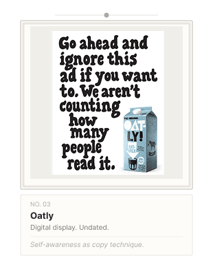
Oatly ran a print and outdoor ad that read: “Go ahead and ignore this ad if you want to. We aren’t counting how many people read it.” It is the opposite of everything in this article: long, no CTA, no benefit, no hook. And that’s precisely why it works. The rule-breaking is the message. Oatly didn’t describe oat milk or ask for a click. It described the absurdity of trying to make you care about oat milk, and in doing so made you care more. The copy didn’t perform advertising; it refused to, loudly enough that you noticed. Audience awareness is a copy technique too, but it only works when the brand has already earned the right to be this strange.
Conclusion
Banner copy isn’t a marketing mystery. It’s a production constraint with a fixed anatomy, a fixed budget per size, and a fixed relationship to the design around it. Designers who can write and evaluate the copy own the full workflow, not the half of it that ends when the visual is approved.

The next banner you produce doesn’t need a copywriter on call. It needs the same care you give to layout, type, and animation, applied to fifteen to twenty words that have to do a lot of work in a very small space.
P.S. The AT&T banner from 1994 had no A/B test, no heatmap, no attribution model, and no retargeting pixel. It had a question nobody had ever been asked before and a CTA that was a bet. Sometimes the oldest trick is still the best bet.


