Choosing color combinations for display ads usually stalls at the same place: you have a hundred palettes that look good in a swatch tool and no way to tell which one holds up inside a 300x250 unit on a cluttered page. The palette that wins is rarely the prettiest. It is the one with the most contrast, a clear hierarchy, and a call to action (the button or link you want the viewer to click, such as "Shop now") that nothing else on the ad competes with. This guide hands you a repeatable method instead of another gallery. You will shortlist colors by association, split them across the ad with the 60-30-10 rule, reserve the strongest contrast for the CTA, check the result against real readability standards, then test it at the size it will run. Work in that order and color stops being a matter of taste you have to defend and becomes a decision you can back with measured contrast and test results.
Key takeaways
Contrast and visual hierarchy decide whether a display ad gets noticed, because viewers skip anything shaped like an ad (banner blindness).
The grayscale test, converting the ad to gray, shows whether the headline and button still stand out on contrast alone.
The 60-30-10 rule splits an ad palette into 60 percent dominant, 30 percent secondary, and a 10 percent accent reserved for the call to action.
Ad text needs a 4.5:1 contrast ratio against its background, and large text or buttons need 3:1, under WCAG 2.2.
In the best-known button test, red beat green by about 21 percent on a mostly green page, which points to contrast rather than to red itself.
Smaller units such as 320x50 need more saturation and stronger text-to-background contrast, and one scheme kept across every size builds recognition.
How does color affect display ad performance?
Contrast and visual hierarchy drive attention and clicks in a display ad. The specific hue matters far less than most palettes assume. A viewer scanning a page has learned to skip anything shaped like an ad, a habit usability researchers Benway and Lane named banner blindness (the tendency to ignore regions of a page that look like advertising) back in 1998. Your unit earns a glance only when it separates itself from whatever surrounds it, which is a contrast problem before it is a color problem.
That reframes the most repeated claim in this space, that red buttons always win. In a 2011 Performable experiment later reported by HubSpot, a red button did outperform a green one by about 21 percent. The most repeated explanation is that the page around it was mostly green, so red was the higher-contrast choice. Paras Chopra of Visual Website Optimizer made the same point in 2010: on a green-themed site, a stark red button can win, which is a contrast result rather than a red result. The CareLogger test he cites lifted sign-ups by 34 percent by switching the button from green to red.
Color psychology still belongs in the process, but as association rather than law. Colors carry learned meanings that change with the brand around them and the culture reading them, so treat those meanings as a starting point you verify before you trust them.

Color psychology in display ads: what each color signals
Use these associations to build a shortlist, then let contrast and testing make the final call. A peer-reviewed study by Labrecque and Milne (2012), "Exciting red and competent blue," found that color changes how a brand's personality is read, and that it helps most when the hue fits the personality the brand wants to project.
Color | Common associations | Works well for | Watch out for |
Red | Urgency, appetite, energy | Food, retail, entertainment, clearance | Overuse reads as alarm; vibrates against green |
Orange | Warmth, friendliness, value | Ecommerce, youth brands, deals | Can feel cheap in premium contexts |
Yellow | Optimism, attention, low cost | Travel, food, kids | Weak as text and on white; tiring in large fields |
Green | Health, nature, growth, money | Wellness, finance, sustainability | Muddy shades read as dated |
Blue | Trust, stability, competence | Finance, tech, healthcare, B2B | Overused; low energy for urgency |
Purple | Premium, creativity, imagination | Beauty, luxury, family brands | Reads either regal or cheap by shade |
Pink | Warmth, youth, boldness by intensity | Beauty, lifestyle, younger audiences | Soft tints limit contrast for CTAs |
Black | Sophistication, authority, luxury | Fashion, tech, automotive | Heavy; needs a bright accent to convert |
White | Simplicity, clarity, premium space | Tech, healthcare, minimal layouts | Disappears at the edges without a border |
Gray / beige | Calm, balance, backdrop | Backgrounds behind any accent | Too much reads as low-effort |
These associations are contextual and culturally variable, so they shape a shortlist rather than dictate a choice: red signals celebration in one market and mourning in another. Shortlist two or three colors here, then let contrast decide between them.
The 4 color schemes for display ads
Every scheme below is a way of picking colors that already agree, using the color wheel (the standard ring that arranges hues by their relationships) as the reference. Pick the scheme that fits the job, then apply the discipline in the next section.
Complementary colors sit opposite each other on the wheel, such as blue and orange, and produce the maximum contrast. That makes them the natural pick when a background and a CTA need to do different jobs: a cool field with a warm button reads instantly.
Analogous colors sit next to each other, such as blue, teal, and green, and convey calm and harmony. Use them for lifestyle or brand-story backgrounds where the mood matters more than a hard visual break, then borrow one contrasting accent for the button.
Triadic colors are three hues spaced evenly around the wheel, vibrant but still balanced. They suit youthful, playful, or entertainment brands that can carry the energy without looking chaotic.
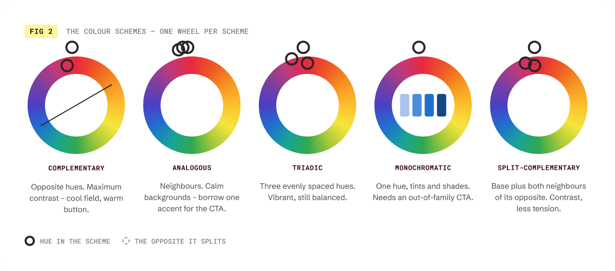
Monochromatic schemes use tints and shades (a hue mixed with white or black) of a single color for a clean, controlled look. They rarely convert without one bright, out-of-family accent for the CTA; without it, the button melts into the field.
Split-complementary is the deeper choice: a base color plus the two hues on either side of its opposite. You keep the strong contrast of a complementary pair with less visual tension, which helps when a straight complementary combination feels too loud. A free palette generator can build and lock any of these from a single base color.
Build your palette with the 60-30-10 rule
A scheme gives you colors that agree; the 60-30-10 rule (a palette split of 60 percent dominant color, 30 percent secondary, 10 percent accent) tells you how much of each to use so the ad reads in the order you want. On a 300x250 medium rectangle the split is concrete. The dominant 60 percent is your background, usually a neutral or a muted brand base that gives the eye somewhere to rest. The secondary 30 percent carries the image, headline block, or supporting shape. The final 10 percent is a single accent you spend entirely on the call to action. Reserve that 10 percent. The moment a second element borrows the accent color, the button stops being the scarcest thing on the ad and the hierarchy collapses.
Keep the whole palette to three to five colors, counting neutrals. Neutrals (white, gray, beige, and near-black) are what make a small ad legible: they hold the background and the text so the accent has room to work. A common failure is a banner built from four saturated brand colors with no neutral anchor, which leaves the viewer with nowhere to look first.
Build and lock the split before you design. Create the palette in a free palette generator, assign each color its 60, 30, or 10 role, and only then start placing elements. Deciding the proportions up front is faster than nudging swatches once the layout is full, and it forces the CTA decision while you can still act on it.

Prioritize contrast: WCAG, grayscale, and a CTA that gets clicks
A scheme and a 60-30-10 split give you a palette that agrees and a hierarchy that reads in order. Contrast is what makes that palette survive contact with a real page. Three checks confirm that before launch: measured contrast against the WCAG standard, a grayscale test, and a CTA that carries the highest contrast on the unit.
a. Check contrast with WCAG ratios and a checker
Contrast ratio (a measure of how readable text is against its background, where 4.5:1 is the standard minimum for normal text) is the one number that tells you whether your headline is legible before anyone sees it. The Web Content Accessibility Guidelines (WCAG) set the thresholds accessibility audits use:
Target | Normal text | Large text (18pt, or 14pt bold) and UI components |
WCAG AA (minimum) | 4.5:1 | 3:1 |
WCAG AAA (enhanced) | 7:1 | 4.5:1 |
Source: W3C, Web Content Accessibility Guidelines (WCAG) 2.2.
Before you export, drop your text color and its background into a free contrast checker. If a pair fails, darken the text, lighten the background, or set a solid block behind the text rather than lowering the standard.
b. Run the grayscale test on your ad
The grayscale test (converting a design to gray to check that the important elements still stand out by contrast alone) catches problems no color picker will. Preview or export the ad in grayscale and look at it: if the headline and the button still stand apart from the background, your contrast is doing the work. If they flatten into the field, the design was leaning on hue, and it will fail for viewers with low vision, on low-quality screens, and anywhere the ad sits on a busy page. The check costs nothing, and it is the quickest check in this article.
c. Make the CTA your highest-contrast element
The call to action should be the single highest-contrast, scarcest color on the ad, so nothing competes with the one thing you want clicked. Choose the CTA color by how far it sits from its background rather than by a hue rumored to convert. A red button on a red-leaning ad disappears, while the same red on a neutral field pulls the eye. When you want to know which of two options performs, run a clean A/B test: ship one CTA color against one other color, change nothing else on the ad, and compare click-through. That isolation is what makes the result trustworthy, and it is why the two button tests above read as contrast wins rather than red wins.

Adjust your colors for ad size and mobile
A palette that looks balanced on a 300x250 can fall apart on a 320x50 mobile leaderboard, because the smaller the unit, the less room detail has to survive. As ad size drops, push saturation up and put more distance between the text tone and the background tone: subtle tonal differences that read fine at large sizes turn to mud at small ones.
The table maps the adjustment to the standard units Google Ad Manager and most networks still sell (legacy Interactive Advertising Bureau, or IAB, sizes).
Ad size | Format name | Color note |
300x250 | Medium rectangle | Room for a full 60-30-10 split; the safest place to set the scheme |
728x90 | Leaderboard | Wide and short; keep text on the dominant field, put the accent CTA at the right |
160x600 | Wide skyscraper | Vertical stack; strong top-to-bottom contrast moves the eye down to the CTA |
320x50 | Mobile leaderboard | Tiny; raise saturation and text-to-background contrast, and drop to two colors plus the accent |
On any ad with a white or light background, add a 1px border so the unit does not bleed into the white of the page and lose its edges. And keep one color scheme consistent across every size in the set, so a campaign reads as one campaign rather than a pile of unrelated banners.
Consistency here is more than tidiness: a distinct palette used the same way across every placement builds recognition, which is its own performance lever over a campaign, separate from what a single unit's contrast does for the click. In Bannersnack, Smart Resize carries a single scheme across every ad size at once. Brand Assets, Brand Colors, and Typography hold the logo, the exact brand colors, and the fonts, and Fetch Brand can pull all three straight from your site. The palette that earns recognition then stays identical from the 300x250 down to the 320x50.
Color combinations by campaign goal (with hex codes)
These palettes are tuned for display legibility: each pairs a neutral-dominant field with one accent reserved for the CTA, and each accent clears at least 4.5:1 against its field.
Check the label text on the button separately (white text passes on the burnt orange, green, and food red accents; use dark text on the rest).
Copy the hex codes (a hex code is a six-character value such as #E85D04 that specifies an exact color) and adjust to your brand.
Found a shade you like in a design already on your canvas? Bannersnack's Color Picker reads its hex straight off the canvas.
Campaign goal | Palette (background / secondary / accent) | Hex codes | Why it works |
Awareness (get seen) | Deep navy / off-white / warm amber | #0B2545 / #F4F7FB / #FFB100 | A wide luminance difference between navy and off-white makes the unit pop in a feed; the amber CTA is unmissable on navy |
Clicks (drive action) | Charcoal / light gray / coral red | #14181F / #E6E9EE / #FF4136 | The dark field maximizes the accent's pull; coral is the scarcest color and owns the button |
Retargeting (re-engage) | White / brand teal / burnt orange | #FFFFFF / #0E7C86 / #C74A0B | A clean, familiar frame for a warm audience; add a 1px border so the white does not bleed |
Premium / luxury | Warm off-black / muted gold / ivory | #1B1A17 / #C6A15B / #F3EFE7 | Restraint signals quality; the gold accent stays quiet and lets the product lead |
For a real reference, Airbnb uses its coral (the brand calls it Rausch, #FF5A5F) as the single accent against neutral fields, so the button is the scarcest color on the ad; Coca-Cola runs red as the dominant field with white as the secondary. Both keep the accent scarce.
If you plan by sector instead of goal:
Sector | Field and accent | Hex anchor |
Finance | Deep blue field, teal accent | #12355B / #2BC4BA |
Health | Light mint field, green accent | #EAF6F1 / #237A50 |
Food | Warm cream field, red accent | #FFF6E9 / #D7263D |
Tech | Charcoal field, sky blue accent | #1F2937 / #60A5FA |
Whichever cut you use, run the exact text-on-background pair through a contrast checker before you ship: a palette that reads well as swatches can still fail as type.
What color combinations should you avoid in display ads?
Avoid any pairing that forces the eye to work: low-contrast text on its background, high-saturation complementaries touching at full strength, light type on white, and too many competing colors.
Low-contrast text on background: the headline or CTA is legible only up close. Raise the contrast until the text pair clears 4.5:1.
Red on green (and other saturated complementaries edge to edge): the boundary appears to vibrate and tires the eye, and the effect is strongest when both colors are fully saturated and similar in lightness. Separate the two hues with a neutral, or lower the saturation of one.
Yellow or pale type on white: the text all but vanishes. Move it onto a dark block, or switch to a darker color.
Too many colors: four or five saturated colors with no neutral leave no clear focal point. Cut the palette to three to five, counting neutrals, and reserve one accent for the CTA.
The grayscale test described above catches most of these before launch: if elements disappear in gray, the combination is relying on hue and needs more contrast.

Conclusion
Good color in a display ad comes from a sequence of checks rather than a lucky palette. Shortlist by association, apply the 60-30-10 split so the ad reads in order, reserve the strongest contrast for the call to action, confirm it against the WCAG minimums and the grayscale test, then test the winner at the size it will run.
Run them and your color choices rest on contrast and test results instead of taste, which is the answer a working designer gives when a client asks why the button is that color.
P.S. If you just spent twenty minutes deciding between #E85D04 and #E8600A, this was written for you. We do it too.