
Most banner ad articles are for buyers. This one is for builders. We break down real static and HTML5 banner ads from a designer’s perspective—what works, why it works, and what to apply to your next build.
Key takeaways
HTML5 banner ads average a 0.44% CTR compared to 0.12% for static banners (Predis.ai, 2025), and 65% of digital advertisers have moved from GIF to HTML5 for animated campaigns (Uplers/Abyssale, 2025).
Color isolation, reserving one hue exclusively for the CTA so it appears nowhere else in the frame, is the most consistent design technique across all ten examples analyzed, from Headspace’s pink button on purple to Amazon Prime’s teal on cool blue.
Google Ads enforces a 150KB maximum file size and a 30-second animation limit on static, GIF, and HTML5 formats; banners that exceed either threshold get rejected on submission.
GIF’s 256-color ceiling causes visible banding and dithering in designs that use gradients or photography, which is the primary technical reason most campaigns now default to HTML5 for animated banners.
The 300×250 medium rectangle carries the highest ad inventory globally and should be the first size in any multi-size set, while the 320×50 mobile leaderboard is the most underproduced format despite mobile accounting for over 70% of web traffic.
Static banner ad examples
Static banners are the most constrained format in display advertising. One frame, no animation, no interaction, just layout, type, color, and a CTA working together in a space most people scroll past in under two seconds.
That constraint is worth taking seriously. Every design decision is visible all at once, which means there's nowhere to hide a weak composition.
The four examples below each demonstrate a different technique for making that single frame count.
1. Headspace: CTA color isolation

Headspace's leaderboard works because the pink CTA button is the only pink element in the entire frame. Purple background, white text, orange logo dot. Nothing else competes with that button for attention. This is color isolation: reserving one hue exclusively for the action you want the viewer to take.
In a 728x90 where you have roughly 90 pixels of vertical space to work with, hierarchy has to be established through color rather than scale. The offer text ("Get 40% off") sits inside the button rather than floating separately, which keeps the value proposition and the action anchored together.
2. Apple MacBook Neo: Gen Z palette + price-first messaging
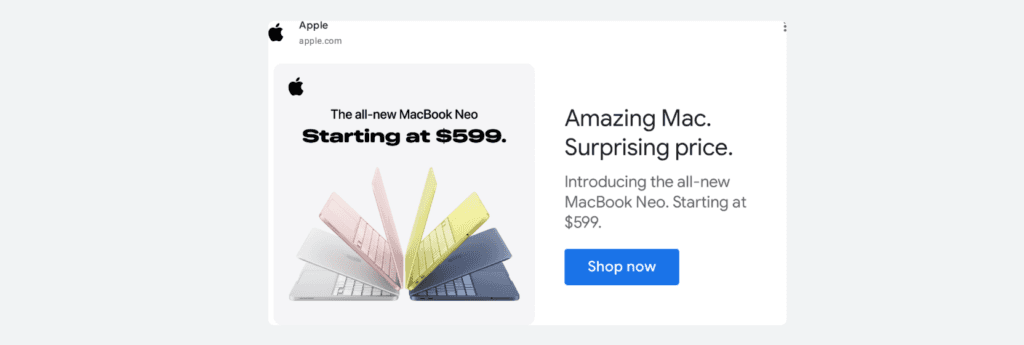
Apple's MacBook Neo banner breaks two of Apple's long-standing display advertising rules at once. The color palette (warm pink, acid yellow) is a direct play for Gen Z buyers, a demographic that responds to expressive color the way previous generations responded to minimalist aluminum. Apple has spent two decades selling silver and space gray.
Switching to pastels in display advertising isn't a refresh; it's a deliberate audience pivot, and the price headline confirms it. "Surprising price. Starting at $599" is Apple explicitly competing on cost for the first time in years, because the audience they're targeting actually comparison-shops.
For designers, the production lesson is specific: color palette is demographic targeting rendered visually. The four MacBook colors aren't decoration, they're the brief. The blue CTA button remains the only blue element in the frame, applying color isolation against a white background.
3. Lululemon: photography-led minimalism

That's Lewis Hamilton leaning over a tire. Not a stock athlete, not a brand ambassador shot from a distance. Lululemon put one of the most recognizable faces in sport into a 728x90 leaderboard with three words of copy and a ghost button.
"Built for breakthroughs" lands differently when the person wearing the gear has 105 Formula 1 race wins. The photograph earns the headline rather than illustrating it. Two production decisions worth noting: the ghost CTA button (outline only, no fill) avoids competing with the image doing the persuasion work.
The desaturated olive and concrete palette separates Lululemon from Nike and Adidas, both of which own primary colors in display. Choosing muted tones against a recognizable face is a competitive positioning decision as much as an aesthetic one.
4. Spotify: monochromatic offer frame
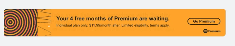
Spotify's leaderboard uses a single-color field to make the offer unavoidable. The entire frame is one color family: orange background, offer text, even the CTA button outline. No photography, no illustration, no visual hierarchy trick beyond type size.
This works when the offer is strong enough to be the visual. "4 free months" needs no supporting imagery because the proposition carries the frame on its own. The ghost button on a colored background applies the same logic as Lululemon's: avoid the filled button when it would pull focus away from what's already doing the work.
HTML5 banner ad examples
HTML5 is where the production investment starts to justify itself. You get a full animation timeline, smooth gradients, real interactivity, and the ability to adapt a single design across every size in your campaign set. HTML5 banners average a 0.44% CTR compared to 0.12% for standard static banners (Predis.ai, 2025), which helps explain why 65% of digital advertisers have moved to HTML5 over GIF (Uplers/Abyssale, 2025).
The tradeoff is real: exports need to comply with platform specs (150KB maximum file size, 30-second animation limit), and every clickable element needs a ClickTag to track clicks and route to the landing page.
The examples below each demonstrate a distinct animation technique, worth understanding as a production approach, not just a visual effect.
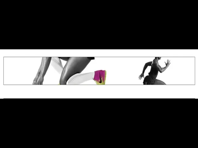
1. Nike "Unlimited Potential": cinematic sequence with selective colorization
Nike put a 30-second film into a 728x90. The governing technique is selective colorization: desaturation strips every frame down to pure form, then color returns at exactly one point, the shoe. It happens twice. First as the athlete accelerates out of the blocks, then in extreme close-up as the foot strikes.
Both times the eye goes straight to the product without a single piece of copy directing it there. The "UNLIMITED POTENTIAL" typography frame is equally deliberate: full black type on white, no imagery, no motion. It's a hard reset between two kinetic sequences, the equivalent of a cut to black in film editing. The swoosh drawing itself at the end is the logo as punctuation rather than introduction.
Nike never shows the logo until the viewer has already watched an athlete become extraordinary while wearing the product. For designers, the production lesson is about restraint: color is a directing tool, not a styling decision. Every frame that withholds color makes the frames that restore it hit harder.
2. Johnnie Walker Red Label: progressive product construction
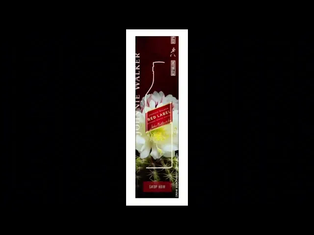
Johnnie Walker sequences the reveal in a specific order: brand name first, label second, bottle last. By the time the bottle outline completes, the viewer has already read "Johnnie Walker Red Label" without the bottle ever appearing as a conventional product shot.
The line-draw animation works because the eye follows a moving path the same way it tracks a pen. The anticipation for the completed form holds attention through the full duration. The cactus flower is a deliberate compositional tension: organic macro photography underneath precise draftsmanship. The spines and bloom create visual complexity that a plain background couldn't, while the clean white line draws itself through that complexity without competing.
Production note: this kind of stroke animation runs on the HTML5 canvas element, with the label sitting on a separate layer above the animated path so it appears fully formed before the line begins.
3. BMW X3: animated data visualization
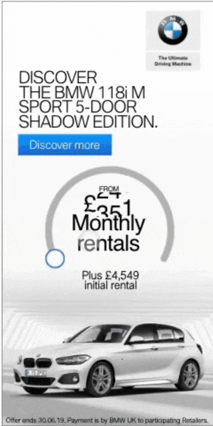
BMW replaces the standard price block with a moment of arrival. The circular gauge draws clockwise and stops at roughly 75%, never completing the arc, which creates implied motion and leaves the eye wanting resolution. The £409 figure lands at the exact moment the arc stops, so the price gets delivered at peak attention rather than sitting visible from the first frame.
Two animation sequences run simultaneously without competing: the arc draws center-frame while the car rises from the bottom. For designers building finance or subscription product banners, this technique is worth adopting directly. It transforms static pricing information into a reveal, and a number that arrives means more than a number that was always there.
4. Mastercard: full-frame typography animation
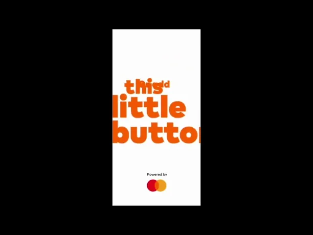
The Mastercard banner removes every production decision except typesetting. No photography, no illustration, no background color. Each cycle brings a new full-frame headline at large scale, and the type carries all the visual weight. "Hire the fraud squad" works because the language is unexpected for a financial product: direct, slightly confrontational, written the way a security briefing sounds rather than a bank ad.
The magnifying glass is the only graphic element and it's functional rather than decorative, reinforcing the fraud detection message without adding visual noise. The technique proves a specific point: when font choice, scale, and copy are right, nothing else is needed. The production overhead is minimal, one of the lightest HTML5 builds possible, which means the creative investment went entirely into the writing.
5. Heineken: template-plus-variable dynamic creative

Heineken built one template and filled it with the world. The structure never changes (video scene on top, green brand band below, bold white copy, Heineken logo), but the scene and the copy line rotate across four completely different social contexts: ice fishing in the Arctic, a glamorous party, a formal gala, and a product close-up. Each version targets a different moment while the brand container stays identical. This is the production logic behind dynamic creative at scale: separate what changes from what doesn't. The green band, the type treatment, and the logo are locked.
The scene and the copy line are the variables. Building the template this way means the campaign can expand to twenty contexts without redesigning the banner once. The full-green CTA frame at the end applies color isolation at its most extreme. When your brand color is this strong, removing everything else from the frame makes the action clearer than any contrasting button could.
6. Amazon Prime: atmospheric scene with neon draw-on
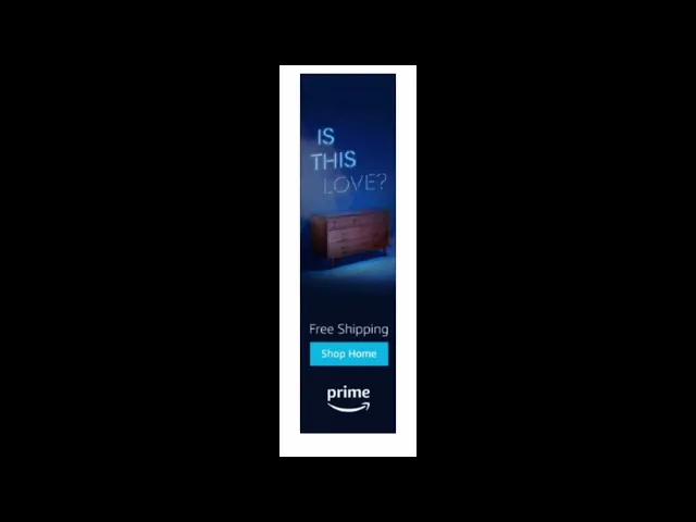
Amazon Prime advertises furniture the way a film still advertises a movie. The dresser sits inside a mood rather than against a white background with a price tag. The neon headline draws on letter by letter, building curiosity before the commercial ask arrives in the lower third. The banner splits into two distinct zones (atmospheric scene on top, conversion mechanics below) with a hard horizontal line between them. That line is a deliberate design decision: it lets both halves do their jobs without blending into each other.
The teal CTA button is the only warm-spectrum element in a frame that's otherwise entirely cool blue, color isolation applied to a dark palette. The neon draw-on effect is a CSS text-stroke animation with a glow filter rather than a video element, which keeps the file weight within the 150KB limit while still delivering the visual effect.
Anatomy of an effective banner ad
Every example above, static or HTML5, product shot or cinematic sequence, shares the same underlying structure. The format changes. These elements don't.
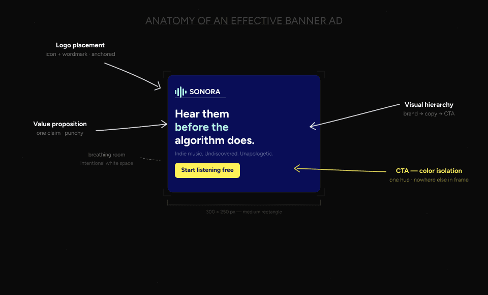
Essential elements every banner needs
Logo placement. Visible but not dominant. The logo establishes brand without competing with the CTA. In every example above, the logo sits in a corner or at the base, present from the first frame, never fighting for attention.
One clear message. A 300x250 has room for roughly 7-10 words of copy that a viewer will actually read. Nike used three words. Heineken used five. The banners that try to communicate three things communicate nothing. Pick the single most important claim and build the layout around it.
A CTA that earns its contrast. Every effective example above follows the same rule: the CTA button is in a color that appears nowhere else in the frame. Headspace uses pink on purple, Amazon uses teal on blue, and BMW uses blue on white. The moment you use the CTA color anywhere else in the layout, the hierarchy breaks.
Visual hierarchy. In a static banner, the eye needs a directed path: brand recognition first, value proposition second, CTA third. In HTML5, the animation timeline does this work sequentially. Johnnie Walker's sequence is the clearest example: name, then label, then bottle, then CTA. Each element arrives in the order you want it read.
File weight discipline. 54% of visitors are already suspicious of banner ads before they've read a single word (Email Uplers, 2024). Banner blindness is real, and a banner that loads slowly or jitters confirms that suspicion before the design has a chance to work. Google Ads enforces a 150KB maximum for good reason. Lightweight banners load before the viewer has scrolled past.
A note on accessibility: sufficient color contrast and readable type sizes at small dimensions aren't just compliance concerns. They're the same decisions that make banners work for everyone. The Mastercard and Nike examples both pass contrast requirements while also being two of the strongest designs in this article. The overlap isn't coincidental.
Standard banner ad sizes quick reference
When producing a multi-size set, these five formats cover the majority of available display inventory. Start here before expanding to secondary sizes.
Size | Name | Priority note |
300×250 | Medium rectangle | Highest inventory globally. Always produce this first. |
728×90 | Leaderboard | Desktop standard, top-of-page placement |
160×600 | Wide skyscraper | Sidebar placement, strong for vertical formats |
300×600 | Half page | High-visibility, growing inventory |
320×50 | Mobile leaderboard | 70%+ of web traffic is mobile. Don't skip this one. |
The 320×50 is the size most designers underinvest in. At 50px tall you have no room for layout complexity, just type, logo, and CTA. Designing that constraint well is harder than it looks.
How to choose the right banner format
Format comes before the design brief. Each format has different production requirements, different capabilities, and a different ceiling for what's possible.
Format | File weight | Animation | Color depth | Best for |
Static | Lightest | None | Full | Fast turnaround, retargeting, tight budgets |
GIF | Light to medium | Frame-based | 256 colors max | Simple animation when HTML5 isn't available |
HTML5 | Medium | Full timeline | Full | Animation quality, interaction, multi-size sets |
Video | Heaviest | Full motion | Full | Product demos, brand storytelling, premium placements |
The 256-color ceiling on GIF is the decision-maker for most campaigns. If your design uses gradients, photography, or color-accurate brand assets, GIF will band and dither in ways that undermine the creative. HTML5 handles all of it, which is why 65% of digital advertisers have moved to HTML5 over GIF (Uplers/Abyssale, 2025). The production overhead is higher, but the output quality gap is significant enough to justify the switch for most campaigns.
For Google Ads specifically, HTML5 exports must stay under 150KB and total animation must not exceed 30 seconds. Static and GIF have the same 150KB limit. Video requirements vary by placement.
Production tips: file size, animation, and ad compliance
Five things to know before you export for an ad network.
150KB file size limit. Google Ads enforces this for static, GIF, and HTML5 formats. The fastest reductions come from image compression, reducing the number of animated layers per slide, and converting raster elements to SVG where possible. If you're working with a third-party ad server, an AdTag solution can bypass the 150KB restriction. The tag loads the creative from an external server rather than serving the file directly.
30-second animation limit. Google Ads requires all animation to stop by 30 seconds. After that the banner must hold on a static frame. Design your timeline with this in mind, because a banner that loops indefinitely gets disapproved on submission.
ClickTag. Every HTML5 banner needs a ClickTag: a tracking parameter that makes the entire design clickable and routes the click to a landing page. Without it the banner won't track clicks and won't pass platform validation. Most HTML5 production tools including Bannersnack handle ClickTag implementation automatically. If you're exporting from Google Web Designer or a custom build, it needs to be added manually before upload.
Animation efficiency. Fewer animated layers per slide means smaller file weight and smoother playback. If you're hitting the 150KB ceiling, the first thing to audit is your timeline, because redundant layer animations add file weight without adding visual value.
AMPHTML. For campaigns where file weight is critical, AMPHTML banners are a lighter alternative to standard HTML5. They run in a sandboxed environment that limits what's possible but guarantees fast load across the Google Display Network.
Building banner ads with Bannersnack
The production decisions covered in this article (animation timing, multi-size adaptation, platform-compliant export) are the same ones Bannersnack was built around. The editor handles HTML5 animation without writing code.
Smart Resize adapts a single master design across 50+ standard IAB formats. ClickTag support is built in, so two common reasons HTML5 ads get rejected (wrong ClickTag implementation and file size violations) are handled before you upload.
Exports work with Google Ads, DV360, and most programmatic ad servers. The animation timeline, the layout decisions, and the type choices are still yours. Bannersnack handles the production infrastructure; you handle the creative.
Conclusion (start building!)
Two formats and ten brands, but the underlying logic is consistent: the best banner ads make one decision well and commit to it completely. Nike commits to selective colorization. Heineken commits to a single template. Headspace commits to one color for one button. Mastercard commits to type and nothing else.
Format matters. Static, HTML5, and video each serve different campaign needs and carry different production requirements. But format is a constraint to design within, not a substitute for a strong creative decision.
If you're ready to build, Bannersnack gives you HTML5 animation, multi-size adaptation, and platform-compliant export in one place. Create your first HTML5 banner and let the creative follow from there.
P.S. The 300×250 is the most produced banner size in the history of digital advertising. Somewhere right now, someone is resizing one manually. Don't be that person.


