In 1994, AT&T ran the first banner ad on HotWired.com. It earned a 44% click-through rate. In the late 1990s, display ads still averaged around 2% CTR. Three decades later, the average banner ad CTR has collapsed to 0.05%, and over 80% of users now ignore banner ads entirely.
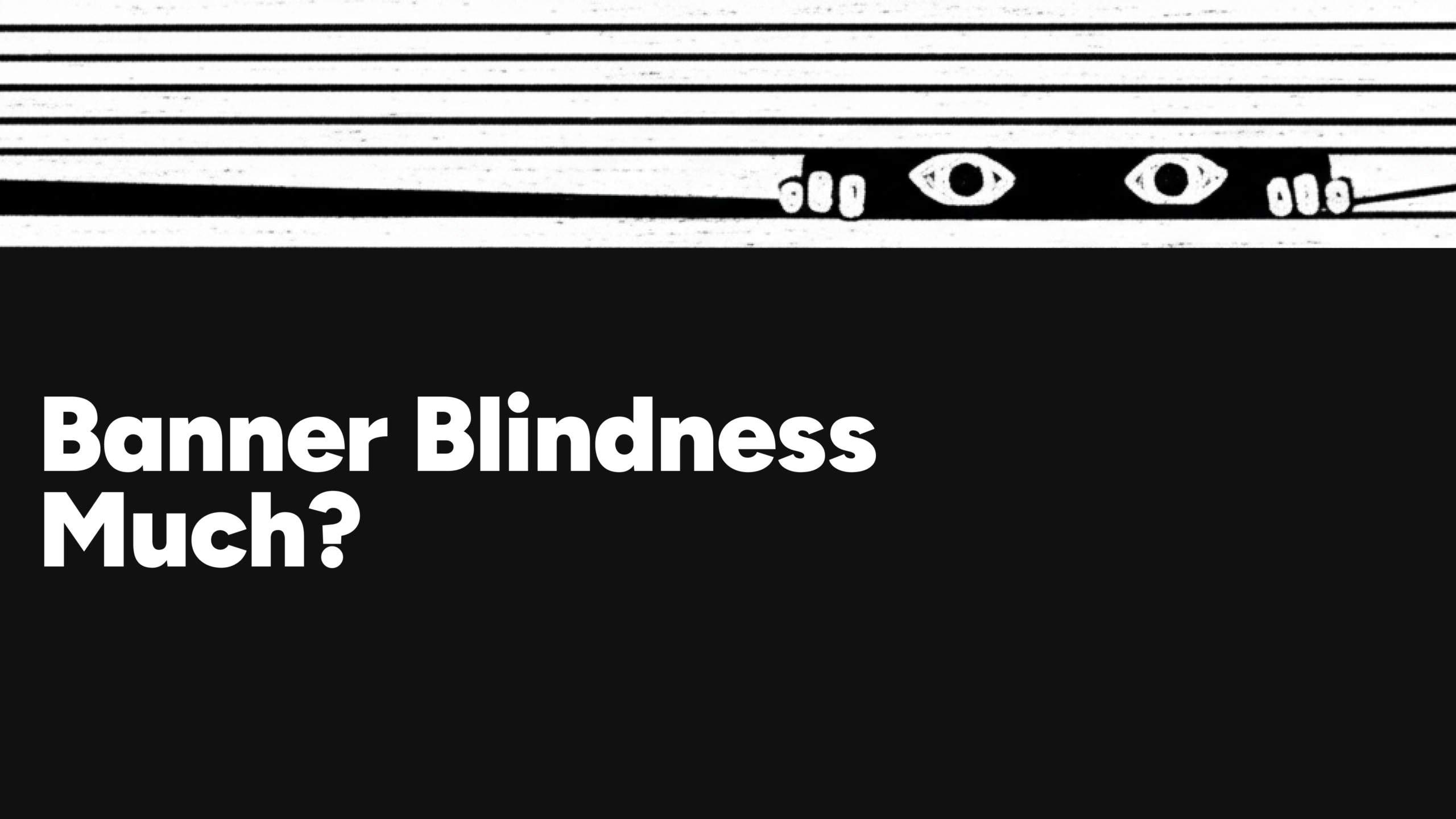
Over thirty years of web browsing, users have catalogued what ads look like. Standard dimensions, predictable screen positions, familiar visual cues. The brain processes these signals and filters them before conscious attention engages. The ad registers as noise, not content. The format became invisible not because it stopped working technically, but because it became predictable.
Banner blindness was never about banners. The format became invisible because it became predictable, and predictability is the actual mechanism at work. The counter-strategy is not louder creative or smarter targeting but breaking the pattern that triggers the filtering in the first place.
This article covers what banner blindness actually is, the psychology that drives it, what it costs advertisers in wasted spend, and a format-level approach that most campaigns have not tried yet. One question runs through every section: what if the ad did not look like an ad?
What Is Banner Blindness?
Banner blindness describes the tendency for web users to ignore page elements that look like advertisements, or that occupy positions traditionally reserved for ads. The behavior is both conscious and unconscious. A user may actively choose to skip a banner, but more often the filtering happens before the ad reaches awareness at all.
The term was coined by Jan Panero Benway and David Lane in a 1998 study at Rice University. Their research showed that users systematically missed links embedded in banner-style placements, even when those links contained the exact information they were searching for. Placement in an ad-like position was enough to render content invisible, regardless of relevance.
Eye-tracking research from the Nielsen Norman Group has confirmed and expanded this finding across three decades of studies, from 1997 through 2024. Their data consistently shows that users develop stable avoidance patterns around known ad positions and ad-like visual structures.
Understanding how that filtering works reveals not only why banner blindness happens, but what specific visual signals drive it and what it would take to interrupt the pattern.
Why It Happens: The Psychology of Predictability
Selective Attention and Task Focus
The brain is constantly filtering sensory input to protect the current task. When a user opens a page to read an article, compare products, or find a specific answer, anything unrelated to that goal gets deprioritized. Ads fall outside the user’s task by definition. But the filtering is not random. It follows learned visual patterns. The brain recognizes what ads look like and applies the filter before the ad content has a chance to compete for attention. The user does not decide to ignore each ad individually. The decision was generalized across a category long ago and now runs automatically.
The Ad Schema: What Your Brain Expects an Ad to Look Like
Eye-tracking research shows a consistent pattern: users scan pages in an F-shape, reading left to right across the top, then down the left margin, actively avoiding the right sidebar and top banner zones where ads traditionally sit. This avoidance is not random. Through repeated exposure, users have built a mental model (a schema) for what ads look like. Standard IAB dimensions (728×90, 300×250, 160×600), right sidebar placement, top banner positions, bold calls to action layered over stock photography: these are the visual ingredients the brain has filed under “ad.”
The schema is strong enough that non-ad content placed in ad-like positions gets ignored too. Predictability is the root mechanism. The brain does not evaluate each ad individually. It matches a visual pattern and skips.

Inattentional Blindness: The Deeper Mechanism
Banner blindness is a specific case of a broader cognitive phenomenon: inattentional blindness, where people fail to perceive objects when their attention is focused elsewhere. The classic demonstration is the invisible gorilla experiment, where viewers counting basketball passes miss a person in a gorilla suit walking across the screen.
The irony with banner ads is that they are no longer unexpected. The brain has reclassified them from “surprise interruption” to “predictable background noise.” Once that reclassification happens, the same mechanism that makes people miss a gorilla walking through a basketball game makes them miss a 300×250 ad placement on a news page. Cognitive load compounds the effect. The more content competing for attention on a page, the more aggressively the brain prunes anything it has already categorized as low-value.
Availability Bias: Why Bad Experiences Compound
If past encounters with banner ads involved slow loading, irrelevant targeting, or deceptive click patterns, the brain generalizes from those memories. This is availability bias at work: users form fast judgments about ad interactions based on the experiences they remember most vividly. Each negative experience trains stronger avoidance.
Across thousands of browsing sessions accumulated over years, this becomes near-automatic. The brain is not evaluating individual ads. It is filtering an entire category of visual experience that it has already judged as not worth the cognitive cost of engagement.
What Banner Blindness Costs Advertisers
The psychology translates directly into wasted spend.
Across all display formats combined, the average is 0.46%. The gap between those two numbers tells its own story: banner-specific formats (the ones users have most thoroughly catalogued) perform an order of magnitude worse than the display category overall. Format recognition, not content quality, is the primary drag on performance.
Viewability compounds the problem. According to Google’s own measurement data, 56% of display ads are never seen by a human. The study is a decade old, but no equivalent Google viewability benchmark has replaced it, and industry data suggests the problem persists. Before blindness can filter an ad, the ad has to appear in the viewport. More than half never get that far. The result is that advertisers pay for impressions that generate zero conscious attention, let alone a click or conversion.
Two related phenomena need separating here, because conflating them leads to fixing the wrong variable. Banner blindness is a pattern-recognition problem: the brain ignores anything matching its ad schema. Ad fatigue is a different mechanism entirely: the brain ignores a specific ad it has seen too many times. Blindness operates at the format level. Fatigue operates at the creative level. Different problems require different responses.
Ad blocking represents the behavioral endpoint. When users move from unconscious avoidance to installing software that removes ads from the page entirely, the pattern-recognition problem has escalated into a technical barrier. All three phenomena erode the same budget, but addressing banner blindness specifically means rethinking the visual format itself, not just the creative or the targeting.
Common Counter-Strategies (and Why They’re Not Enough)
The advertising industry has developed several approaches to counter banner blindness, and most of them work, within limits.
Native advertising matches the surrounding content’s format and editorial tone, making the ad less visually distinct from organic material. The strategy works because it makes the ad harder to classify as an ad. The limitation: it sidesteps the format problem rather than solving it. The approach relies on disguise, and audiences learn new patterns over time.
Contextual targeting and personalization reduce the irrelevance that accelerates filtering by serving ads based on page content or user behavior data. A user reading about running shoes is more likely to register an ad for running shoes. Relevance helps, but the ad still sits in a standard placement inside a standard container, and the brain’s visual filter triggers on shape and position before it evaluates content. Unconventional placement and design try to solve this by avoiding standard ad positions and dimensions. Early results look promising, but users update their avoidance patterns faster with each iteration.
Rich media and interactive formats demand a moment of active engagement, which disrupts passive filtering. The interaction requirement forces a pause. But the creative still lives inside the same rectangular containers.
Each of these strategies operates within the existing visual framework. They improve what goes inside the box: better content, better targeting, better interaction mechanics. The box itself remains unchanged. And the box (the rectangular container with its standard dimensions and predictable position) is what the brain has learned to flag and dismiss.
The Rectangle Problem: Why the Container Is the Real Constraint
Every standard display ad format is a named rectangle. Leaderboard: 728×90. Skyscraper: 160×600. MREC: 300×250. Half page: 300×600. The container defines the creative space, and users have mapped every one of them.
The counter-strategies covered above optimize what happens inside that container. Native advertising disguises the contents. Rich media animates them. Contextual targeting fills the rectangle with relevant material. None of them changes the rectangle itself, the visual boundary the brain has filed under “ad.”
Video has already begun disrupting the static-rectangle schema. Video display ads generate more engagement than static formats. Global video ad spend is projected to reach $198 billion in 2025, roughly 22% of global ad budgets. Motion, narrative, and format novelty bypass the pattern recognition that filters static banners.
But standard video ads still live inside standard containers. Pre-roll interrupts content. In-feed video competes with organic posts. And the rectangular video player is itself becoming a recognized ad pattern. Users are learning to filter it the same way they learned to filter the 300×250 MREC.
The banner ad does not have to be a rectangle. The entire history of display advertising has been defined by the container: standard dimensions, standard positions, standard borders. Decades of display creative have lived inside these boxes, and decades of user behavior have adapted to ignore them. What changes when the creative escapes that container entirely? When the visual element floats over page content with no bounding box, no standard frame, no rectangular border signaling “this is an ad”?
That is what transparent video makes possible. And it represents a genuinely different approach to the format-level problem that drives banner blindness.
Transparent Video Ads: When the Creative Escapes the Box
Transparent video is video content rendered with an alpha channel, a transparent background that lets the creative element composite directly over page content. No visible rectangular container. A product animation, a motion graphic, or a character illustration floats within the page layout as if it belongs to the content rather than sitting alongside it.
Technically, full cross-browser support requires two formats: WebM with VP9 alpha for Chrome, Firefox, and Edge, and MOV with HEVC alpha or ProRes 4444 for Safari.
The connection to banner blindness is direct. The brain’s ad schema depends on visual signals: recognizable dimensions, a visible border, a rectangular boundary separating ad space from content space. Transparent video matches none of those signals. The creative element integrates with the page rather than occupying a separate, labeled zone. The brain’s pattern-matching system encounters something it has not catalogued as “ad,” and the automatic filtering does not engage in the same way.
The technical container still exists. The ad lives inside a standard ad slot for delivery and measurement. But the visible creative breaks free of the rectangular frame, which is the specific signal that drives learned avoidance.
Until recently, producing transparent video for display advertising required specialized encoding workflows, and most ad platforms could not serve alpha-channel video reliably across browsers. That barrier is dropping. Bannersnack now supports transparent video natively: upload a WebM or MOV with alpha channel, and the platform handles cross-browser format serving automatically. The transparent video works across all export formats (HTML5, JPG, PNG, PDF, MP4, GIF) and scales across 50+ sizes through the Banner Generator.
The creative workflow this opens up: build any animation in After Effects, Blender, or DaVinci Resolve, export as transparent video, import into Bannersnack, and produce ads with that animation preserved across every required format and size.
Some constraints apply. Transparent video is still relatively new for display advertising, and not every ad platform supports it yet. Teams that do not already produce video will need to develop that capability. And creative execution matters more with this format than most: a poorly composited transparent overlay feels more intrusive than a standard banner, not less. The format’s advantage is integration with the page, not interruption of it.
How to Measure Banner Blindness
Diagnosing banner blindness on a live campaign requires looking beyond click-through rates.
A/B testing isolates format effects. Compare static banners against rich media, video, and transparent video placements. Test different positions and dimensions against standard IAB slots. The goal is to identify at which format level the avoidance kicks in: whether the problem is creative, placement, or container shape.
Beyond CTR, track attention metrics: time-in-view, scroll depth near ad placements, and hover patterns. CTR alone cannot distinguish between an ad that was never seen and an ad that was seen but failed to compel a click. That distinction determines whether the response should target placement, format, or creative, and which variable to test first.
Banner blindness has deepened for three decades because the visual language of advertising has not changed with it. The container stayed the same, users catalogued it, and the brain automated the filtering.
The counter-strategy starts with breaking the visual pattern the brain has learned to skip. Transparent video is one of the few format-level tools that does this: it removes the visual signature the brain uses to classify and dismiss an ad, rather than hiding the ad itself.
The first banner ad did not have to compete with thirty years of learned avoidance. Everything published after it does.
P.S. It turns out Banner blindness isn’t about bad ads after all. It’s about recognizable containers.
